Home > Statistics > Good teaching > Data representation > Creating pie graphs
Creating pie graphs
It is important that students understand the part-whole relationship that exists when creating a pie chart.
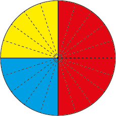
A circle, or pie, represents the whole of the data set (population or sample) that is the focus of discussion.
Usually the segments of a pie graph are labelled in percentages adding to 100% but fractions can be used.
The segments of a pie graph can be marked using a protractor and the percentage of 360 degrees that makes up the segment. However, it is also possible to create a pie graph with concrete materials. With small data sets and frequency data for each category, each value in the same category can be placed along a strip of paper in equal intervals.
The strip of paper is then rolled into a circle. Draw lines to connect the middle of the circle with the boundaries of the categories to create the pie graph.
Sleuthing pie graphs
After reviewing the properties of a pie graph, students investigate another pie graph.

