Home > Statistics > Good teaching > Data representation > Creating pie graphs > Sleuthing pie graphs
Sleuthing pie graphs
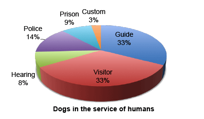
Begin a discussion by considering the pie graph below. It is labelled in percentages, and it can be checked that they add up to 100%, representing the 'whole' for this context.
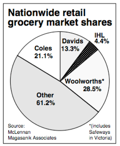
Students are then asked to consider the following graph (individually or in groups) and answer the questions.
- What is the context for this pie graph?
- Is there anything unusual about this graph?
- Using your understanding of percentage, what can you tell by looking at this graph?
- How can you check mathematically whether the definition of a pie graph is satisfied or not? Show your work.
After discussing their answers, students could be asked how the error might have occurred.
An extension activity would be to ask students to recalculate the percentage values for the pie assuming that the relative values in the original graph are correct. The values in this pie were calculated in 1993 for the Australian Financial Review. A further extension could be to find the data for the current year, especially for Coles and Woolworths, and compare with 1993.
You can download the Pie Graphs: Student Worksheet and accompanying Pie Graphs: Answers.


