Home > Statistics > Good teaching > Using different media > Digital media
Digital media
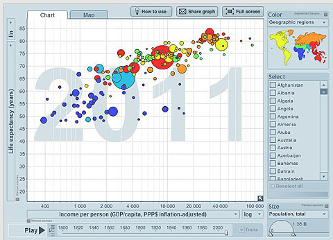
It is important that the web sources chosen are robust and reliable. The Gapminder website provides a number of dynamic and powerful displays of data, videos and links, as well as teacher resources. The statistics are drawn from official international and national sources.
This Youtube presentation 200 countries, 200 years, 4 minutes – The Joy of Stats by Hans Rosling is a dynamic demonstration with commentary that explores the development of nations over the years since 1800. This graph represents changing conditions in nations of the world by basically correlating how long people live and how much money they earn, but cleverly incorporating three continuous variables and a categorical variable displayed over time.
This is a powerful tool to investigate issues in the social sciences.

