Home > Patterns > Assessment > Approaches to assessment > Analysis of student work > Bar charts
Bar charts
Students were just learning how to draw bar charts.
The teacher had started with examples where the frequencies were all small numbers.
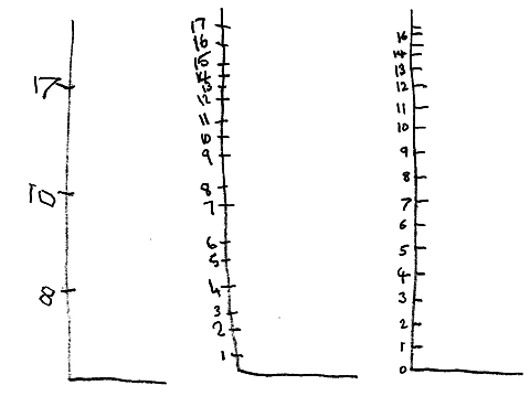
Then she asked students to draw a bar graph to illustrate these data with larger numbers.
| Favourite sport | Frequency |
| Soccer | 17 |
| Cricket | 10 |
| Baseball | 8 |
When the teacher reviewed their graphs after the lesson, the teacher found that many students had used an uneven scale on the frequency axis. Most of them had also labelled each number instead of labelling the scale in twos or fives.
The teacher concluded that students did not sufficiently understand patterns in number lines. She decided to do some more work on number lines in the following lesson.
Once students were able to draw and use number scales better, she returned to drawing bar charts.

