Home > Statistics > Assessment > Assessment tasks > Assessing the media
Assessing the media
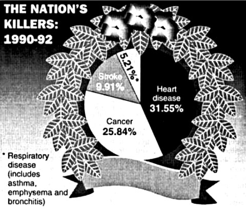
This graphical representation in the Pie Graph Activity: Student Worksheet provides the opportunity to assess students' understanding through identifying errors and omissions in the way the data are reported.
- What is the context for this pie graph?
- Is there anything unusual about this graph?
- Using your understanding of percentages, what can you tell visually by looking at this graph?
- How can you check mathematically whether the definition of a pie graph is satisfied or not? (Show your work.)
- How might this error have occurred?
Depending on students' experiences, questions (1), (4) and (5) of the task could be deleted and the intent of the survey question could be to determine student understanding without any hints.
You can also download the Pie Graph Activity: Answers.

