Home > Statistics > Misunderstandings > Difficulties with informal inference > Features of box plots
Features of box plots
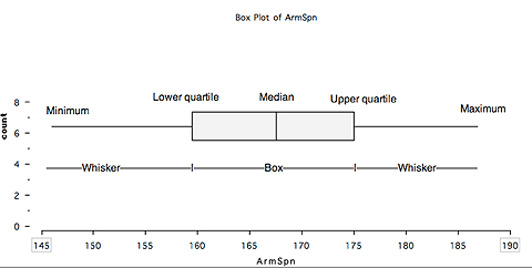
A box plot is based on the five-number summary for the data set:
- the minimum value
- the first (or lower) quartile
- the median
- the third (or upper) quartile and
- the maximum.
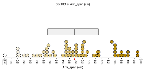
Generally a box plot appears without the data.
Using a stacked dot plot at the same time as the box plot can help students visualise the data distribution.
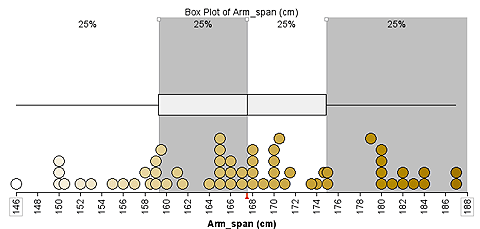
The software TinkerPlots can show the percentage of the data in each part of the box plot.
The next step is using box plots to make informal inferences.
The amount of overlap of box plots for two data sets helps determine whether a difference in the data sets (and their underlying populations) is meaningful or not.
Criteria are discussed in the article Box Plots in the Australian Curriculum on the AAMT website.


