Looking for ideas to help your teaching?
What’s in your top drawer?
Rummage through these drawers for
  • expert advice
  • teaching suggestions
  • classroom activities
or SEARCH for key words

Media > TDT > Statistics > S_GT_T5_E1_fig1

S_GT_T5_E1_fig1
« 
Previous image
|
|
Next image
 »

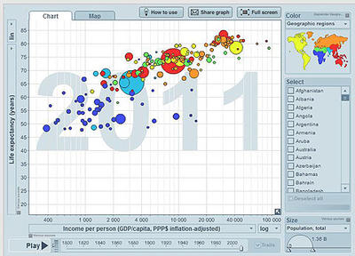
Positive correlation between income per person and life expectancy. African nations at the lower end, Asia in the centre, the Americas and Europe at the higher end.

Graph from Gapminder showing correlation of wealth and lifespan for 200 countries in 2011.
Source: Gapminder, Free material available from www.gapminder.org

Related content

S_GT_T5_E2_...

S_GT_T2_E2_...

S_GT_T2_E1_...

S_GT_T2_E1_...

S_GT_T1_E3_...

S_GT_T1_E2_...