Looking for ideas to help your teaching?
What’s in your top drawer?
Rummage through these drawers for
  • expert advice
  • teaching suggestions
  • classroom activities
or SEARCH for key words
Media > TDT > Patterns > P_CM_M3_E3_fig1

P_CM_M3_E3_fig1

« 
Previous image
|
|
Next image
 »

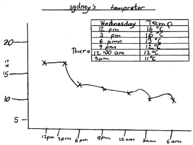
A hand-drawn graph showing Sydney’s temperature over 15 hours, with uneven markings on both the vertical and horizontal axes.

Student's temperature graph.

Related content